Visualizing LUT data in Blender
Wednesday, 10 May 2023
This animated cube contains the data in a 3D LUT:
A Look-Up Table, as the name describes, is simply a large table of numbers. Given an input color RᵢGᵢBᵢ, you simply go to the corresponding row in the table and find your new color RⱼGⱼBⱼ. Each dot in the video is an RGB values (each axis goes from 0.0 to 1.0) and the color of each dot is the output color RⱼGⱼBⱼ.
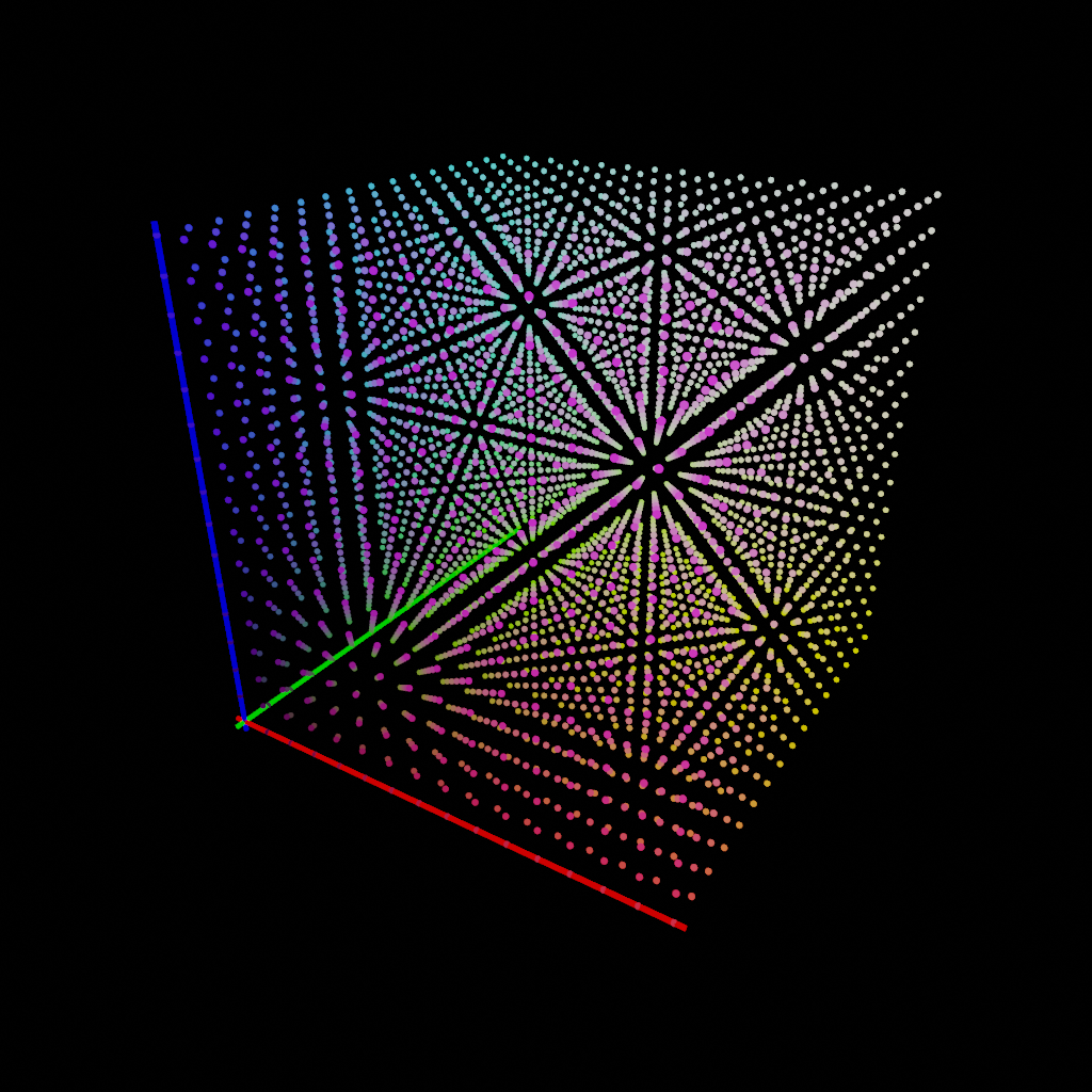
This simplified description glosses over a few details… the main one being that even in 8-bit depth, it’s not practical or useful to include all 8×8×8=16,777,216 possible table rows. If we try looking up a color that’s in between our data points, we need to interpolate between the nearest points. In fact, the cube animation above includes only a subset of the LUT data, and the LUT itself only has 32 points per color axis (about 37k rows).
But it’s a good enough description to understand certain things about what a 3D LUT can and cannot do. A 3D LUT *can* manipulate each RGB triplet uniquely, compared to a 1D LUT which can only manipulate each color channel separately. So it’s possible, for example, to desaturate only oranges with a 3D LUT but not with a 1D LUT.
It also tells us that a LUT cannot shift colors based on the pixel’s location in the image, since the lookup is done only using the input color. Often a LUT is described as a “filter”, but LUTs are less powerful than general-purpose filters. A LUT cannot add a vignette, blur the image, or act as a graduated neutral density filter. All a LUT can do is look at a pixel’s color, look it up in the table, and give you its new color.
Back to the LUT visualization – it’s hard to see the output colors in the original, but this animation shows how each color “moves” from the input location (Rᵢ, Gᵢ, Bᵢ) to its output location (Rⱼ, Gⱼ, Bⱼ). And it visually demonstrates what this LUT does: you can see that many colors in the central part of the cube become brighter as they drift away from (0, 0, 0), and the whites in the upper-right corner get brought down to be less blue. Overall, the dots “stretch” from the center outwards, corresponding to the higher contrast that the LUT gives:

Because the .CUBE format is simple plain text, it was easy to whip up a Python script in Blender to plot out the data:

The code reads the LUT into memory and then for each point, creates an instance of a template object (the sphere) and gives it a color (the output color of the LUT) and two keyframes, the first being the input color converted to coordinates (Rᵢ, Gᵢ, Bᵢ) and the second the output color coordinate (Rⱼ, Gⱼ, Bⱼ).
(This is also how I learned that deleting a mere 4,096 objects in Blender is very, very slow. Something about having to check all data relationships for every single object…)
Download the Blend file containing the script and scene:
No. 1 — January 17th, 2024 at 00:51
HI!!!
Just wanted to say this is awesome! exactly what I’ve been trying to do for the past few days, I am not a programmer, so I can`t seem to move too much of the code without breaking it, is there a way to do this visualization but with particles or volumes? instead of mesh instances, would love any help or feedback